lost and found book and movie

|

|
in the move, the boy's house is a fish shop and this is the reason why the penguin chose the house.

this is one of the original scene in the movie. The photo penguin took is important in the last scene.

both the book and the movie have the scene but this angle is an original in the movie. This angle expresses how little they are and the little boy and the little penguin go adventure.

Original scene in the movie, the penguis swam. This scene has the sense of speed. Only movie can express it.

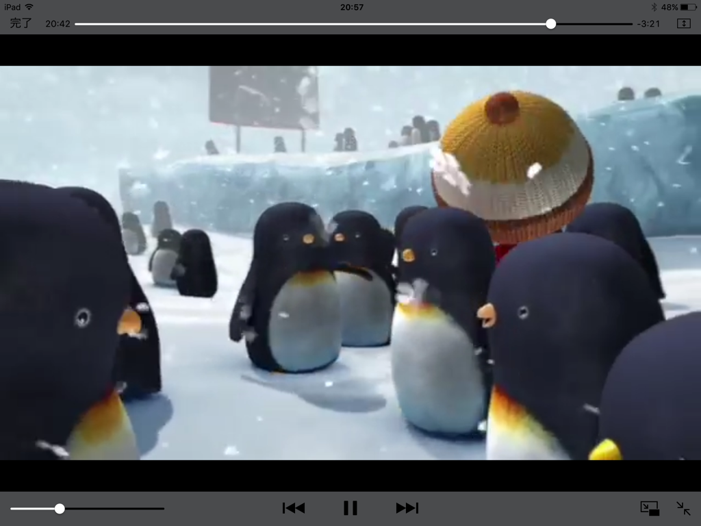
An original scene in the movie. This is the metaphor that the boy sends the penguis Noth Pole. Morevere this scene is strange so maybe it expresses what happens after this scene.

this scene emphasizes the tough scene more than the book and expresses their friendship.

This is an original scene in the movie. This scene helps the movie to be more fantasy

This scene is very important in the movie because in the movie, no one speak except the narrator. The image is more impressive than the speech narrator speaks.
|

|
The scene links the scene which many ducks on the sea. This is good for the last scene and this scene makes this movie more dramatic.

|

|
both scene is almost same but only boy's look is different .the movie is easier to understand boy's feeling than the book
my childhood book

Title: Gurunpa no youchien/ Author: Minami Nishiuchi
Criterion Score...28
Artistic style and graphic excellence...4
(including typography and its suitability for the implied readership)
Comments:thre are many coloes and soft lines
Effective use of media and technique...4
Comments:an elephant is familior to the children
Color, line, shape, texture...4
Comments:this book have many colors so children will enjoy if they cannoy read the text.
Relationship between illustration and text...3
Comments:pictures are funy but texts is nomal font.
Consistency of style, characterization, information and setting...5
Comments:the elephant's job huntind is interesting.
Clarity appropriateness and aesthetic appeal of illustrations...4
Comments:pictures are drewn in detales and clarity
Quality of book design, production, printing and binding...4
Comments:the shape of the book is effective to show the pictures.
General Comments: (Including qualities or merits of the book not captured by the above
criteria):the picteres are good and funy but text is sometime too long.
lost and found
lost and found review
Title: lost and found/ Author: Oliver Jeffers
Criterion Score.....33
Artistic style and graphic excellence...5
(including typography and its suitability for the implied readership)
Comments:all outlines ware soft and drewn with free hand. it match to the story.
Effective use of media and technique...5
Comments:backgrounds are effective to explain the world view
Color, line, shape, texture...5
Comments:the pictures have soft colors and soft lines. the texturea are match to the pictures
Relationship between illustration and text...4
Comments:the combination of the soft pictures and the simple text are good
Consistency of style, characterization, information and setting...4
Comments:the situation is unreal but easy to image fof children
Clarity appropriateness and aesthetic appeal of illustrations...5
Comments:all pictures are simple and easy to understand
Quality of book design, production, printing and binding...5
Comments:the sfape of the book is square and it match to the story and pictures.
General Comments: (Including qualities or merits of the book not captured by the above
criteria):this book tells us the importance of the friends. symple texts and pictures are easy to understand for children.
books review
Book #1 – Title / Author: Swimmy/Leo Lionni
Criterion Score .....31
1)Artistic style and graphic excellence.....5
(including typography and its suitability for the implied readership)
Comments: A few sentence par pages was easy to understand.
2)Effective use of media and technique.....4
Comments: little fish corporate with each other to become a big fish to defeat a tuna.
3)Color, line, shape, texture.....4
Comments: Leo Lionni used soft color on background. The soft color empathize little fish.
4)Relationship between illustration and text.....5
Comments: The illustrations are delightful. It is about a little black fish banding together to fight the larger fish in the sea. The text tells us That we can be themselves and care about other at the same time. He uses illustration to tell us the content of text.
5)Consistency of style, characterization, information and setting.....4
Comments:Even there was a sad situation for Swimmy, he encouraged other small fish and drive away a big tuna. His bravery is great.
6)Clarity appropriateness and aesthetic appeal of illustrations.....5
Comments:Leo Lionni uses things like stamp. There are many impression by this technique.
7)Quality of book design, production, printing and binding.....4
Comments:Swimmy has a hard cover and less page but good content. These are good point for children.
Book#2- CURIOUS GEORGE / H.A.REY
Ceiterion Score.....28
1)Artistic style and graphic excellence.....4
At first sight, the illustration looks very simple but actually many part were drawn in detail.
2)Effective use of media and technique.....5
Some items or animals or human were drawn few lines so it looks not real. It give readers soft impression.
3)Color, line, shape, texture.....4
There are many vivid colors but many kinds of lines so the illustration can show materials of some items.
4)Relationship between illustration and text.....4
It's good relationship. Some sentences weren't written to the last. Instead of the sentences, pictures shows the story. It is interesting composition.
But some pictures don't accommodate the sentences.
5)Consistency of style, chacterization, information and setting.....4
Setting of the picture book is very simple. Information that reader know about George is just he is curious but it is enough to understand the development of the story.
6)Clarity approppriateness and aesthetic appeal of illustrations.....3
Some picture didn't show the context of the sentences. For example in sentence said scary but the picture looks like smile.
7)Quality of book design, production, printing and binding....4
The quality is good. A illustration of the binding is very simple but color of it is vivid yellow. So it stands out and.
8)General Comments
the book was interesting for children but it is strange for adults.
